
Office Painting in Brampton: Colors That Boost Productivity
Office Painting in Brampton: Colors That Boost Productivity
By Dreamy Coats Painting
When businesses in Brampton plan an office renovation, the conversation often starts with layout, furniture, and technology. Yet, one of the most powerful tools for influencing workplace performance is frequently overlooked: the paint on the walls.
Color is not merely decorative. It is a silent communicator that affects mood, focus, and even physiological responses. For local business owners and facility managers, selecting the right shade for a workspace is a strategic decision. At Dreamy Coats Painting, we believe that a professional office painting job should do more than just look fresh—it should create an environment where employees thrive.
However, navigating the world of color psychology can be tricky. Does blue always make you calm? Is red truly aggressive? And what about the actual safety of the paint itself?
This guide explores the nuanced relationship between office colors and productivity, helping you make informed choices for your commercial space in Brampton.
The Science Behind the Shades
The idea that color impacts performance is supported by decades of environmental psychology research. A study on office interior schemes found that while individual sensitivity to color varies, the right palette can significantly lower anxiety and fatigue .
Research indicates that workers in specific environments reported lower levels of fatigue compared to those in neutral white or grey spaces . Another study focusing on chromatic (colorful) versus achromatic (grey/white) schemes found that participants generally performed better and found the environment more pleasant and dynamic when color was present .
However, it is important to note that color is not a one-size-fits-all solution. The effectiveness of a hue often depends on the specific task and the individual’s sensory sensitivity . This is why a strategic approach—mixing colors based on the function of the room—is superior to painting an entire office a single “productivity” shade.
Room-by-Room Color Strategy
To optimize workflow, consider dividing your office into zones. Different tasks require different mental states, and color can help trigger those states naturally.
1. Focus Zones: The Case for Blue and Green
For areas requiring deep concentration—such as accounting departments, legal offices, or individual workstations—cool tones are the top choice.
- Blue is associated with calmness and clarity. Studies suggest that blue environments help reduce stress and support mental endurance, making it ideal for high-pressure work or long hours of data analysis .
- Green is the most restful color for the human eye. It reduces eye strain and is often linked to restoration and balance . For employees staring at screens all day, a soft green accent wall can provide a subtle “visual break.”
2. Creative Hubs: The Energy of Yellow
Brainstorming rooms, design studios, and marketing departments benefit from stimulation.
- Yellow is linked to optimism, creativity, and enthusiasm. It can spark innovation and encourage out-of-the-box thinking .
- A word of caution: High-intensity yellow can cause overstimulation or anxiety if overused. Instead of a bright lemon, opt for a buttery or pale gold tone. Alternatively, use bright yellow as an accent piece, such as a painted door frame or a feature wall, rather than the entire room.
3. Detail-Oriented Tasks: The Power of Red
While often viewed as aggressive, red has a specific and powerful place in the office.
- Research has shown that red elevates heart rate and blood flow, which boosts performance on tasks requiring attention to detail—such as proofreading, quality assurance, or data entry .
- In the workplace, red should be used sparingly. It works well in a storage room where quick, physical work is done, or as an accent in a lobby to create energy. It is generally unsuitable for a lounge or break area where relaxation is the goal.
4. Professional Settings: Neutral Doesn’t Mean Boring
Reception areas and client-facing conference rooms need to convey professionalism, stability, and trust.
- Warm grays, taupes, and off-whites create a timeless backdrop that allows your brand colors to pop without overwhelming visitors.
- The risk: Heavy use of stark white or dark grey has been shown to suppress energy and sometimes contribute to fatigue . We recommend balancing neutrals with natural wood textures, plants, or a single vibrant wall to keep the space grounded but not flat.
The Health Factor: Low-VOC and Zero Emissions
In a post-pandemic world, indoor air quality (IAQ) is a top priority for Brampton employers. Traditional paints can release Volatile Organic Compounds (VOCs) and Semi-Volatile Organic Compounds (SVOCs) into the air long after the roller has been put away, contributing to “Sick Building Syndrome” and employee headaches.
Modern coating technology has advanced significantly. Industry leaders have introduced innovations like “Near-Zero SVOC” dispersions, which minimize the need for chemical coalescents, ensuring that the air remains clean without sacrificing the durability of the paint finish .
For office environments, selecting paint with zero emissions is critical. Products are now available that carry third-party certifications from organizations like Green Seal and the Asthma & Allergy Friendly Certification Program . These paints feature low odor that dissipates rapidly—sometimes within an hour—allowing businesses to reoccupy spaces almost immediately after the job is done. This minimizes downtime for offices in busy areas like Bramalea City Centre or near Airport Road .
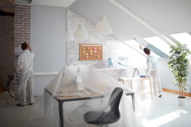
Why Professional Application Matters
You might have the perfect color swatch, but the outcome depends entirely on the preparation and execution.
Lighting is variable. Natural light shifts throughout the day, and fluorescent bulbs can alter how a color appears. A professional painter knows to test samples under the specific lighting conditions of your office before starting the full job .
Surface preparation prevents distraction. Bumpy walls, peeling corners, and uneven finishes can be visually distracting, subconsciously lowering the perception of quality and professionalism. A professional team ensures the canvas is flawless before the color is applied.
Bringing It to Life in Brampton
Whether you are refreshing a medical clinic, a tech startup, or a law firm, the goal remains the same: to align your environment with your business goals.
At Dreamy Coats Painting, we specialize in transforming commercial spaces throughout Brampton. We understand the local architecture and the need for minimal disruption to your workday. By combining the principles of color psychology with the safest, most advanced low-emission materials, we help you create an office that doesn’t just look painted—it looks purposeful.
Ready to boost your team’s potential? Contact Dreamy Coats Painting today for a consultation. Let us help you choose the palette that drives productivity, protects your employees’ health, and elevates your brand.
Recent Post
- Go Bold or Stay Classic: Kitchen Cabinets Painting for Every Style
- Breathe New Life into Your Home With Interior Painting Oakville Services
- Your Path To A Modern Home Makeover With Cabinets Spray Painting
- Perfect Your Kitchen’s Style with Exceptional Kitchen Cabinets Painting Services
- Color Your Business Success with Outstanding Commercial Painting Services
- Breathe New Life Into Your Home with Professional Staircase Painting in Brampton